
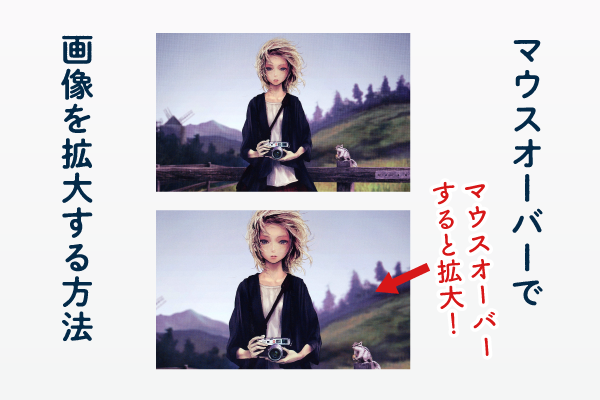
画像にカーソルを乗せて拡大させるのは、実務でも非常に良くある実装ですね。
画像を表示させるには「imgタグ」と「background-image」の2種類の方法がありますが
今回は両方のケースで画像を拡大する方法を解説していきます。
hover(マウスオーバー)で画像を拡大する方法(imgタグ)
まずは、『imgタグ』を使った場合です。
<div class="sample-img">
  <img src="画像パス" alt="">
</div>
.sample-img {
cursor: pointer;
max-width: 500px;
overflow: hidden;
width: 100%;
}
.sample-img img {
height: auto;
transition: transform .6s ease; /* ゆっくり変化させる */
}
.sample-img:hover img {
transform: scale(1.1); /* 拡大 */
}transform: scale(1.1);で、画像が拡大しています。
これは数字が大きいほど拡大し、1.0未満だと縮小します。
ポイントはoverflowで、これがないと画像が親要素からはみ出てしまいます。
画像の上に文字がある場合
画像の上に文字がある場合は、このようになります。
<div class="sample-img">
  <img src="画像パス" alt="">
  <p>テキスト</p>
</div>
.sample-img {
cursor: pointer;
max-width: 500px;
overflow: hidden;
position: relative;
width: 100%;
}
.sample-img img {
height: auto;
transition: transform .6s ease; /* ゆっくり変化させる */
}
.sample-img:hover img {
transform: scale(1.1); /* 拡大 */
}
.sample-img p {
align-items: center; /* テキストの中央揃え */
bottom: 0;
color: #fff; /* テキストの色 */
display: flex; /* テキストの中央揃え */
justify-content: center; /* テキストの中央揃え */
left: 0;
margin: auto;
position: absolute;
right: 0;
top: 0;
width: 80%; /* テキストを横幅いっぱいにならないようにする */
}hover(マウスオーバー)で画像を拡大する方法(background-image)
<div class="box">
  <div class="box-bg"></div>
</div>
.box {
cursor: pointer;
max-width: 500px;
overflow: hidden;
position: relative;
width: 100%;
}
.box-bg {
background-image: url(画像パス);
background-position: center;
background-repeat: no-repeat;
background-size: cover;
height: 350px;
transition: transform .6s ease;
width: 100%;
}
.box:hover .box-bg {
transform: scale(1.1);
}画像の上に文字がある場合
画像の上に文字がある場合は、このようになります。
<div class="box">
  <p>テキスト</p>
  <div class="box-bg"></div>
</div>
.box {
cursor: pointer;
max-width: 500px;
overflow: hidden;
position: relative;
width: 100%;
}
.box-bg {
background-image: url(画像パス);
background-position: center;
background-repeat: no-repeat;
background-size: cover;
height: 350px;
transition: transform .6s ease;
width: 100%;
}
.box:hover .box-bg {
transform: scale(1.1);
}
.box p {
align-items: center; /* テキストの中央揃え */
bottom: 0;
color: #fff; /* テキストの色 */
display: flex; /* テキストの中央揃え */
justify-content: center; /* テキストの中央揃え */
left: 0;
margin: auto;
pointer-events: none;
position: absolute;
right: 0;
top: 0;
width: 80%; /* テキストを横幅いっぱいにならないようにする */
z-index: 1;
}ブログ記事一覧やコンテンツ一覧ページなど、リンクが並ぶレイアウトでよく活用されるこの手法は、ユーザーにとって視覚的な分かりやすさを向上させ、クリックを促す効果が期待できます。
実装も比較的容易でCSSの設定だけで実現できるため、コーディング初心者でも気軽に挑戦できます。ただし、拡大率などの設定を過剰にすると、かえって使いにくくなる可能性もあるため注意が必要です。
リンクに動きを加えたい、Webサイトにアクセントをつけたいと考えている方は、ぜひこの効果を試してみてはいかがでしょうか。